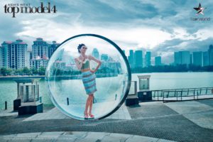
Last Wednesday we witnessed the return of our favorite reality modeling competition, Asia’s Next Top Model. The girls channeled their 60’s groove recreating the iconic photographs from fashion photographer Melvin Sokolsky‘s Bubble Series published in Harper’s Bazaar magazine. This time Filipino photographer to the stars (and equally photogenic) BJ Pascual and the 13 remaining girls brought us back to the heyday of 60’s fashion. Read on for my Asia’s Next Top Model Cycle 4 Episode 1 power rankings.

How did your early favorites fare? Here’s how they ranked based on my assessment of their performance in the 1st episode. Note that I’m only ranking their photos for their 60’s inspired fashion shoot. Groovy.
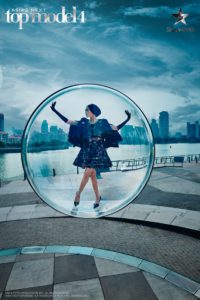
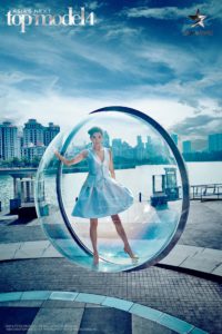
1. Aldilla
60’s elegance in one photo! Aldilla is modelling from head to the tips of her fingers to her toes. This early, she reminds me of Barbara from last cycle. She makes the clothes look very expensive plus makes me want to buy them for myself.
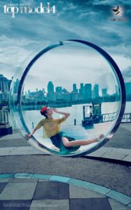
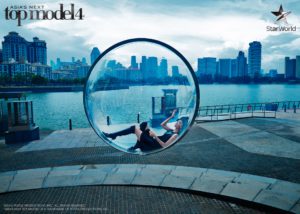
2. Julian
Now that’s how you lose one leg (a Tyra no-no!) but make. it. work. C’est magnifique! I love how Cindy and the judges conjured up the backstory of a rich socialite sunbathing awaiting her champagne because that is exactly what I see in this photo.
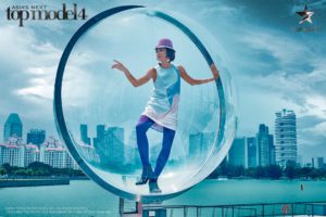
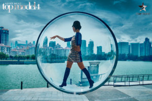
3. Tuti
Edgy? Check. Elegant? Hmm, not quite. She did make great use of the full bubble space. She did not let the bubble limit her. I don’t quite understand this pose but I’m in agreement with the judges that she does know how to showcase the clothes well.
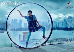
4. Alaiza
She looks like an international spy here. Very 60’s. I do wonder about the right leg placement. It all looks very tentative.
5. Sang In
She’s one of the three that had their final photo in the sitting position, but hers has the least energy. She looks like she’s just lying at the bottom of the bubble there. If it were not for the 60’s brief this would be higher up my ranking. It is still a pretty picture nevertheless.
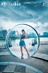
6 & 7. May and Mai Ngo (tie)
Mai Ngo’s left arm position is unsettling. Both her and May fit the brief but their poses didn’t really make use of the bubble as well as the top 5. I do love that Mai Ngo looks like a giant, with her hand grazing the skyline.
8. Tawan
I don’t feel the energy from Tawan. It looks like she’s being photographed in between poses, as if she lost balance. And another Tyra no-no: the no-neck monster!
9. Jessica
10. Patricia
11. Tugs
All pretty girls… but there’s nothing to work with in these photos. They didn’t make full use of the prop, and it’s especially disappointing for Tugs who has very beautifully long arms and legs, in what could have been the perfect opportunity to showcase her model height.
12. Angie
Kudos to Angie for actually executing this challenging pose. But I agree with the judges that she forgot to consider how the garment, all crumpled like that, would look… which is kinda the point of a fashion shoot.
13. Gwen
I could see this pose in a beauty pageant candidate’s glam shot. She does look regal and she’s got great legs. But this photo isn’t really that interesting. Side note though: the judges should really tone down the “beauty queen” criticisms on Gwen. She’s not the only one who has a beauty pageant past.
This is great for the girls’ first photo shoot; they are being challenged this early. I do worry that they’ve probably amped up the difficulty too early. It was heartbreaking to see both May and Tugs crumble under their uncontrollable phobias of confined spaces, and heights, respectively.
What is up with the wardrobe? Most of them wore shades of blue so a lot of them didn’t really stand out from their backdrop, notwithstanding the muted colors of the photo overall. Compare the girls’ photos to the original Harper’s Bazaar cover that I included at the top of this post. The orange flowy dress pops out against the sky blue New York landscape. Only Aldilla’s dress managed to do just that.
Overall, it was okay for a pilot episode of Asia’s Next Top Model. I have to note though that the “scripted-ness” of some of the scenarios on the show is even more obvious this cycle. That whole bit with Mai Ngo’s food issue is cringe-worthy for me because I can already see the producers’ machinations of blowing up the situation to something even more dramatic. Thus the predictably consequential “confrontation” scene at panel. Was it good TV? Sure. Was it predictable? Oh definitely, especially if you’re a fan of reality TV like I am. Thus my Real Housewives comparison in the recap not to mention I finished the whole pilot season of Unreal. 😛
Oh and special mention to that incredibly mean way they eliminated Maya from Thailand. Runway isn’t even a huge component on this show, and they eliminated her based on that alone. They could’ve just given her a penalty like getting only 5 frames for the photo shoot. I’m just hoping that the show will also adopt the callback format from America’s Next Top Model, so she can prove that she deserved to stay longer.
What do you think of Asia’s Next Top Model Episode 1? Do you agree with my ranking of their photos? Who is your FCO? Does Gwen deserve to stay in the competition? Are you scared of confined spaces and heights too? Sound off in the COMMENTS below.





2 Comments
1. I’m gonna agree that maybe Tuti was FCO at the week for some things (like extended leg, etc), but I’m gonna agree with you about Aldilla that she’s really stunning at this photoshoot. So she should be FCO though
2. Actually, this episode reminds me to S2, where Jessie was eliminated for same thing. But I’m gonna agree with you about mean things, especially for Maya. I mean like what models said at the house.. “we’re just said hi”. And also, it makes more frustating for models.
3. Score system ? Really ?
4. Even from S3, this show is just all for drama and ratings. But unfortunately, I’m maybe addicted to it
For ratings..
1. Aldilla -> really really nailed the theme. If no scoring system, then this gonna be FCO easily
2. Julian -> gonna agree with you here
3. Tuti -> gonna agree with you here.
4. Sang In -> not too impressed with her leg position. but her upper up is amazing.
5. Alaiza -> gonna agree with you here. But I would place in 5th because (maybe) her / photoshoot angle
6 / 7. Mai Ngo / May -> really fair point here. I love Mai Ngo’s hand pointing out skyline, meanwhile May’s body pose is amazing
8. Patricia -> I’m gonna think at least she brings story and energy here. but yeah.. Maybe do nothing
9. Tawan -> looks like modern pop than couture 60s
10. Jessica -> really disappointing photo. I love this photo actually, but needs something more
11 / 12. Angie / Tugs -> Angie gives maybe wrong pose towards her clothes, meanwhile at different reason Tugs could be lower than Angie because no drifting effort from her (and agree with you -> she could potentially amazing if she extend her legs and arms at least)
13. Gwen -> agreed with you. Really pageanic